Displays of movie-making techniques
To show techniques and plans for making movies requires displays that show time, 3-space, words, and sound.
Many highly talented visual workers have done so. Here is the beginning of a collection on storyboards, how-to
manuals for moving-making techniques, and project management displays for movies. I hope that our Kindly
Contributors will provide many splendid examples.
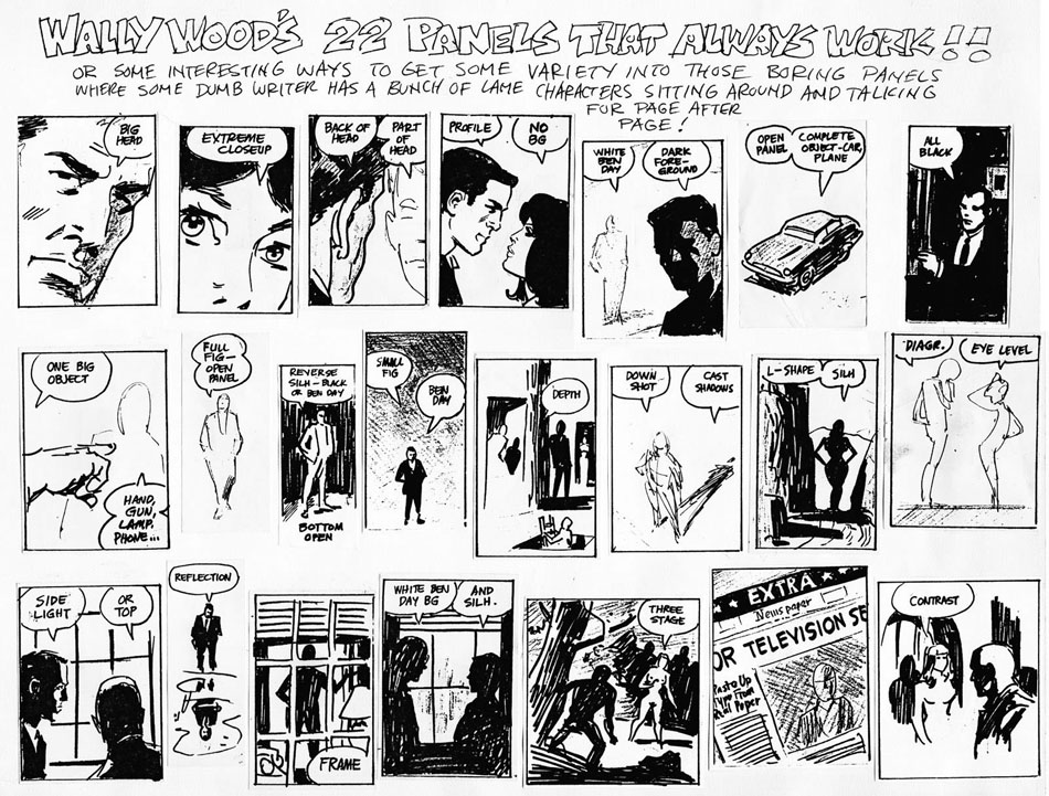
Anne Lukeman of Kill Vampire Lincoln Productions created brilliant small-multiple movies illustrating the classic
small multiple “22 FRAMES THAT ALWAYS WORK!!” by Wally Woods.
First, Wally Woods on the design of panels for comic books:

And here is the wonderful movie version of movie techniques (based on the comic book panels) by Anne Lukeman:
Source: source: Anne Lukeman
As those of a certain age know, “Ben Day” in the comic panels above is the product
name for transparent overlays of varying tones created by small dots of equal size for
each tone. Roy Lichtenstein featured Ben Day dots in his paintings and sculptures.
But “Ben Day” makes no sense in the movie-making world, unless translated into
something like “a soft background area of uniform tone.”
In Beautiful Evidence, I
constructed a storyboard from pieces of Hypnerotomachia Poliphili (Venice, 1499)
and compared it with a storyboard for Alfred Hitchcock’s North by Northwest (1959):

Source: Edward Tufte, Beautiful Evidence (2006), page 92.


http://accad.osu.edu/~pgarrett/730/readings/Week-4.02_strybrd_the_simpsonsway.pdf
A two-minute stop frame of Candide by Voltaire – using the still illustrations of Rockwell Kents 1928 Candide and created by the New York Public Library.
The whirlwind tour fast-forwards through Kent’s illustrations at almost flipbook speed, with a suitable soundtrack (overture from The Magic Flute), accent marks and titles. Many flashing initials and a happy ending.
Illustrations by Rockwell Kent from: Voltaire. Candide. New York: Random House, 1928. NYPL, Rare Book Division. By Permission of the Plattsburgh State Art Museum, The Rockwell Kent Gallery & Collection.
https://www.youtube.com/watch?v=Gk0XY199svk&feature=player_embedded
Best wishes
Matt
Ed Piskor offers a great round-up of that peculiar comics phenomenon: the single panel in which an action and its consequences/reactions share the same visual instant.
The Art Of Cause and Effect In A Solitary Comic Panel
In one respect, storyboards (like movies) present discrete samples of continuous action (just at a much slower frame rate). Scott McCloud’s “Understanding Comics” suggests how we interpolate missing time between comic strip panels in a way analogous to our visual perceptual apparatus creating the illusion of a moving picture from the flashing still frames on a screen.
But a very different kind of mapping, which abstracts the elements of character and setting and plots them over time, may be found at http://xkcd.com/657/large/
“Twelve Angry Men” charts of course as a trivial vertical array of the twelve jurors in their unchanging juryroom setting. On the other hand, fans of the enigmatic film “Primer” will appreciate the visual pun on its convoluted time-travel plot.
One supposes that such a chart of “The Curious Case of Benjamin Button” would prove problematic!