On the Edge, At the Margin: Contours, Surrounds, Frames
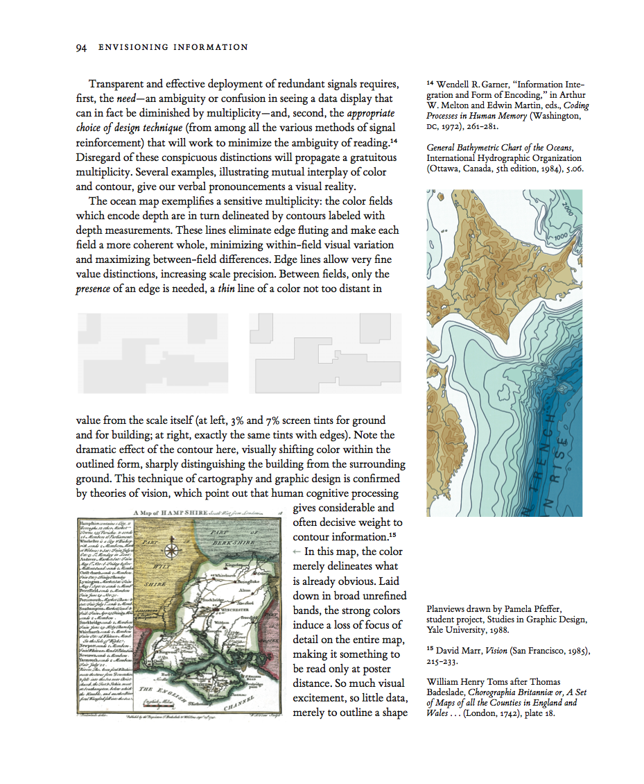
These plan views show the footprints (darker gray fields) of buildings on their surrounding grounds (lighter gray fields). Both plan views are identical, except for the thin lines outlining the buildings at right.
Those thin but highly effective lines shift the color within the building and also the color contrast between building and ground.

In general, perimeter lines cause the eye to homogenize within the contained area, and to separate and differentiate that area from the surrounding external space. A big optical consequence for a very thin line.


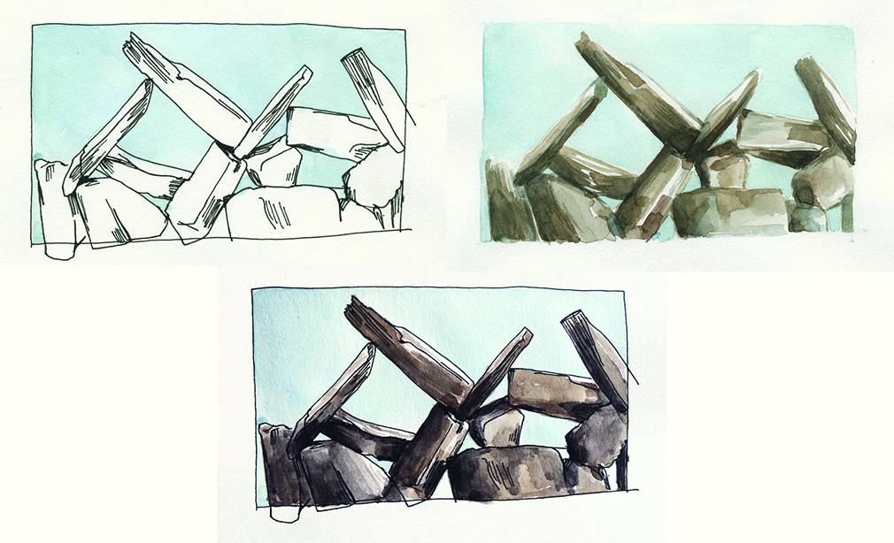
Line and tone drawings exemplify the often wonderful interplay between outline and delicate color-wash tones.
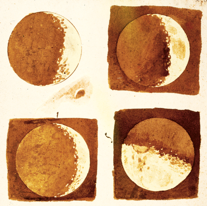
Here Galileo reports his discovery of craters on the moon, with the moon’s outline drawn with a compass:
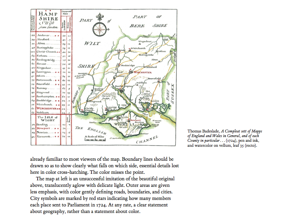
This is how contour maps work: the color fields which encode ocean depth are in turn delineated by contours labeled with depth measurements.
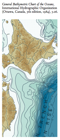
These contours eliminate blurry optical shifts (called “edge fluting”) between adjacent colors, make each contour level a more coherent whole, and minimize within-field variation and maximize between-field differences. Edge-lines allow very fine distinctions, increasing quantitative scale precision. And between the color fields, on the merest presence of a edge is needed, a thin thin line.

Viewers standing inside the 3 legs of Twig 5, a large steel and air artwork, come eventually to see a faint transparent surface, an airy triangle outlined by 2 legs and the ground. Viewers can happily regard this apparent surface as the surface of the pyramidal volume of air contained and held by the artwork itself.
For architects and sculptors, air is a material. Airspace is not the absence of material, air is not “negative space.” Airshapes are created, shaped, and formed by nearby structural materials–steel, concrete, wood, glass. And so Twig 5 is made from steel and air, by volume ~0.1% steel and ~99.9% air. By weight, the reverse.





Neil Dawson Horizons 1994, 15 x 10 x 36m, at the amazing Gibbs Farm in New Zealand.


Or the line-and-tone aluminum foil wrapper in Wendy MacNaughton’s Burrito:

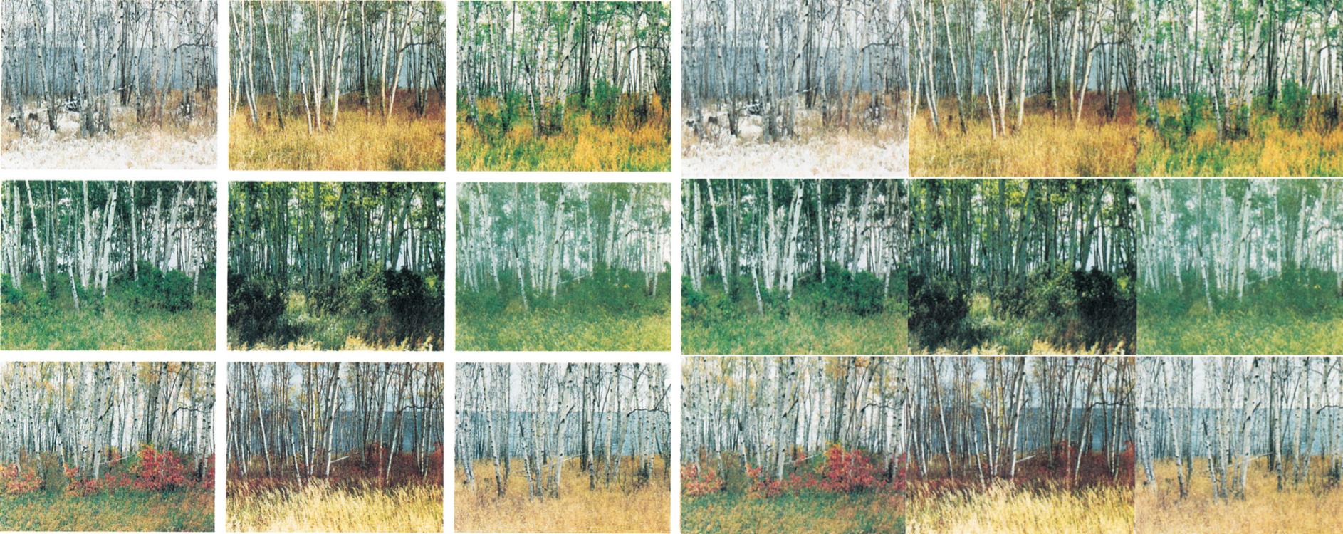
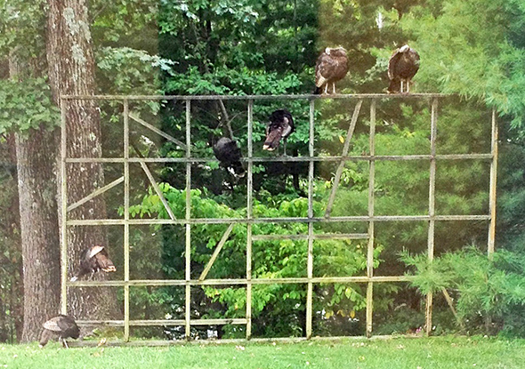
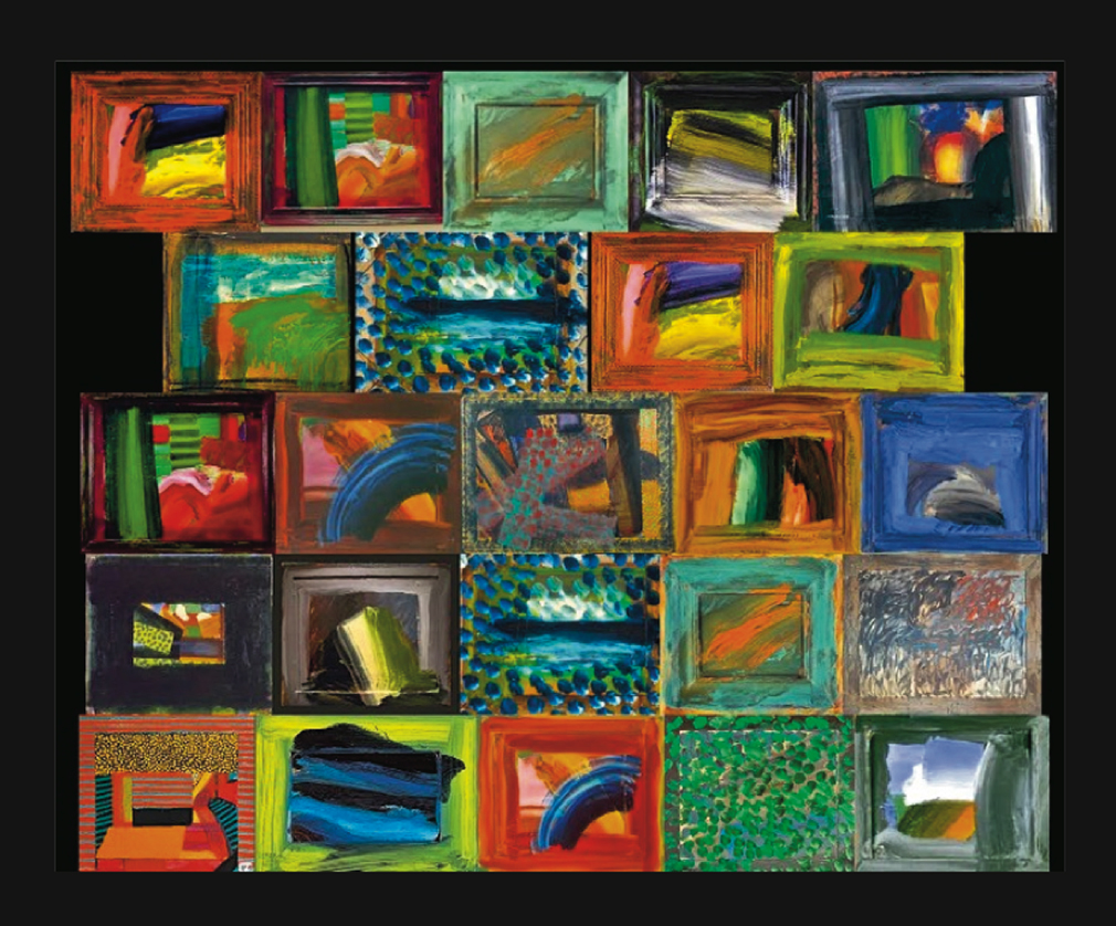
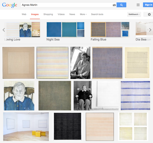
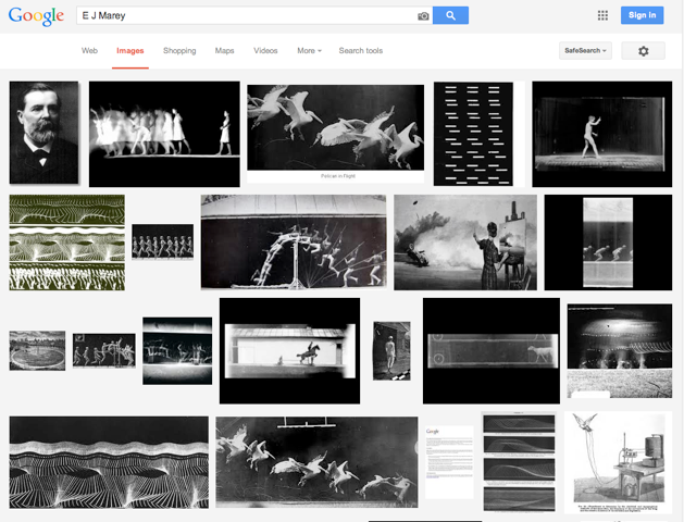
In many arrays of images, the individual images are frames with gaps between images.
[ ET to fill in ]
[ ET to fill in ]
[ ET to fill in ]


[ ET to fill in ]
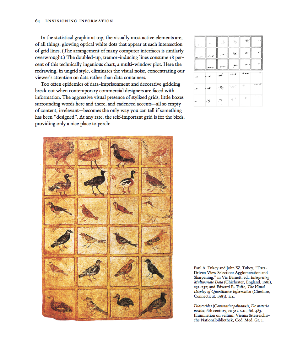
Areas surrounding data-lines may generate unintentional optical clutter. Strong frames produce melodramatic but content-diminishing visual effects. At left, the dominant visual elements are, of all things, the strong stripes of the negative spaces between the heavy frames:

A good way to assess a display for unintentional optical clutter is to ask “Do the prominent visual effects convey relevant content?” In the exhibits above earning the unfortunate X, the most prominent visual effect is usually the clutter produced by activated negative space.
Google Images (2 examples)
31% frame |
32% frame |


Apple iPhone (3 example, including horizontal)

Left: 33% frame Right: 24%
London Portrait Gallery (gold frames)
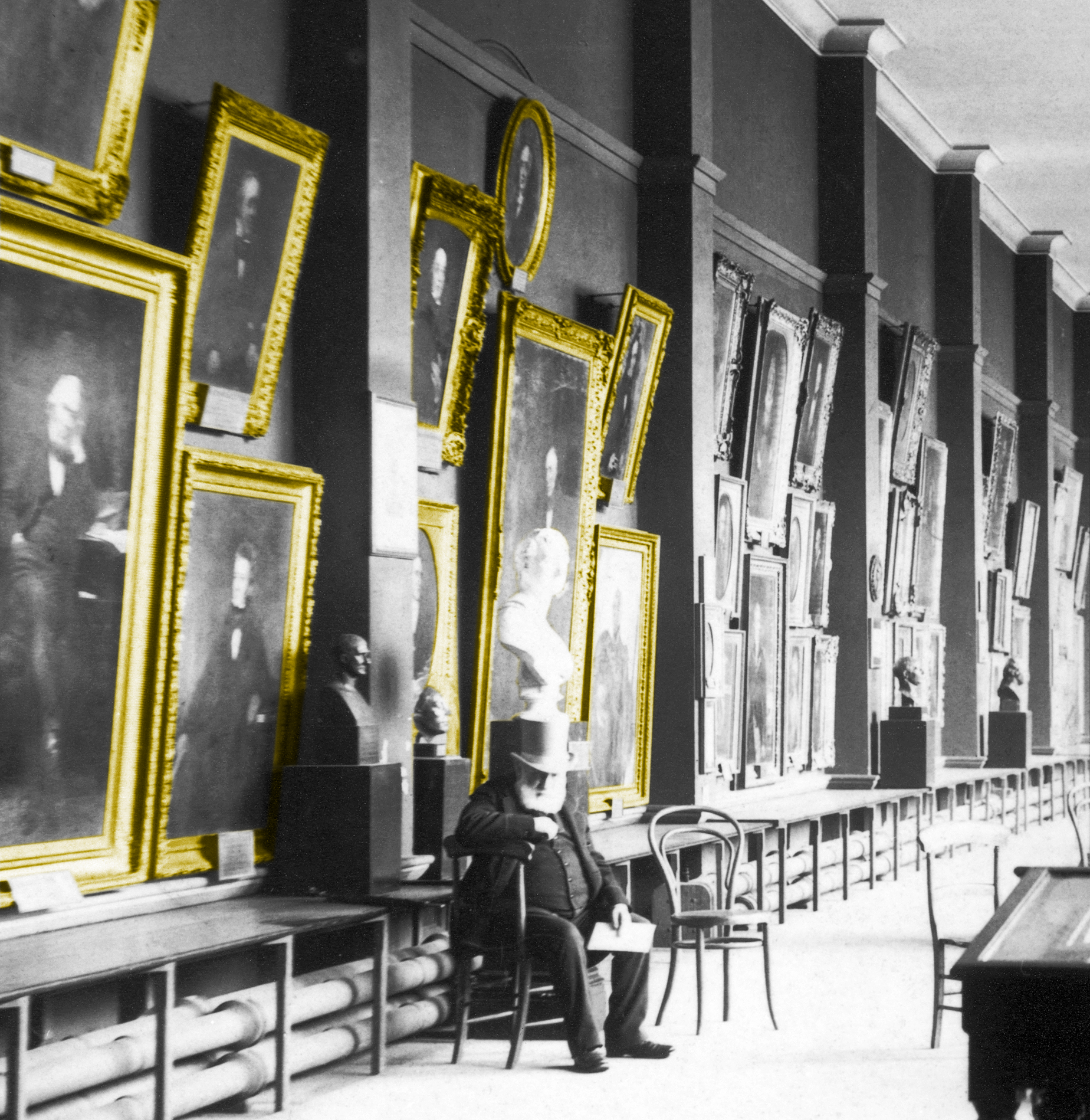
46% frame
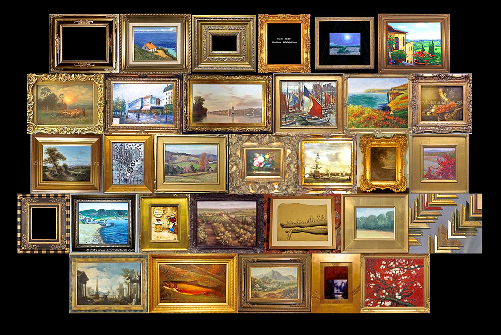
| Frame math paragraph | 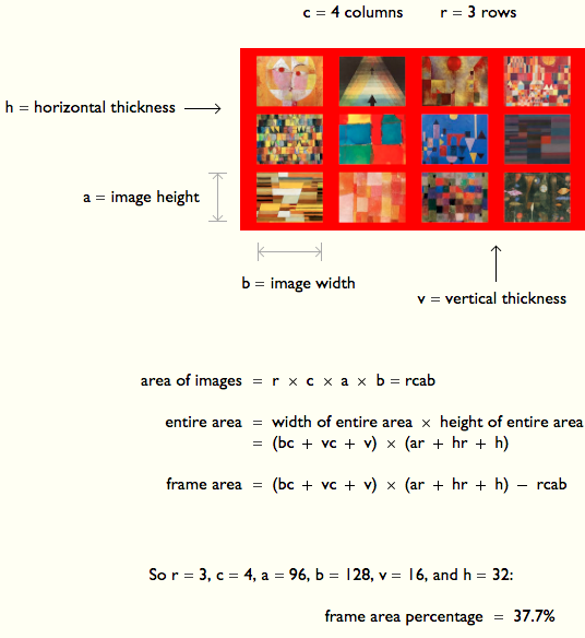 |
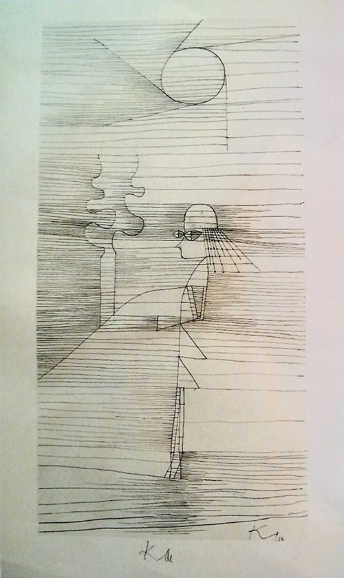
Klee quilt with winking smiley frame
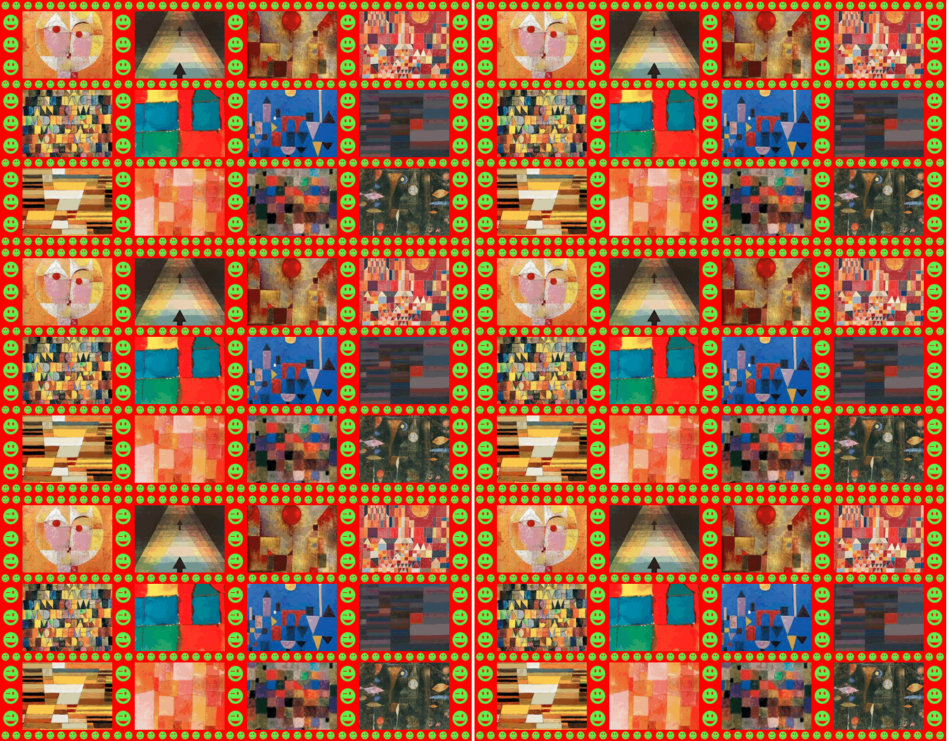
27% frame |
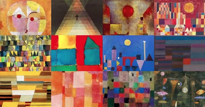
0% frame |
Klee quilt
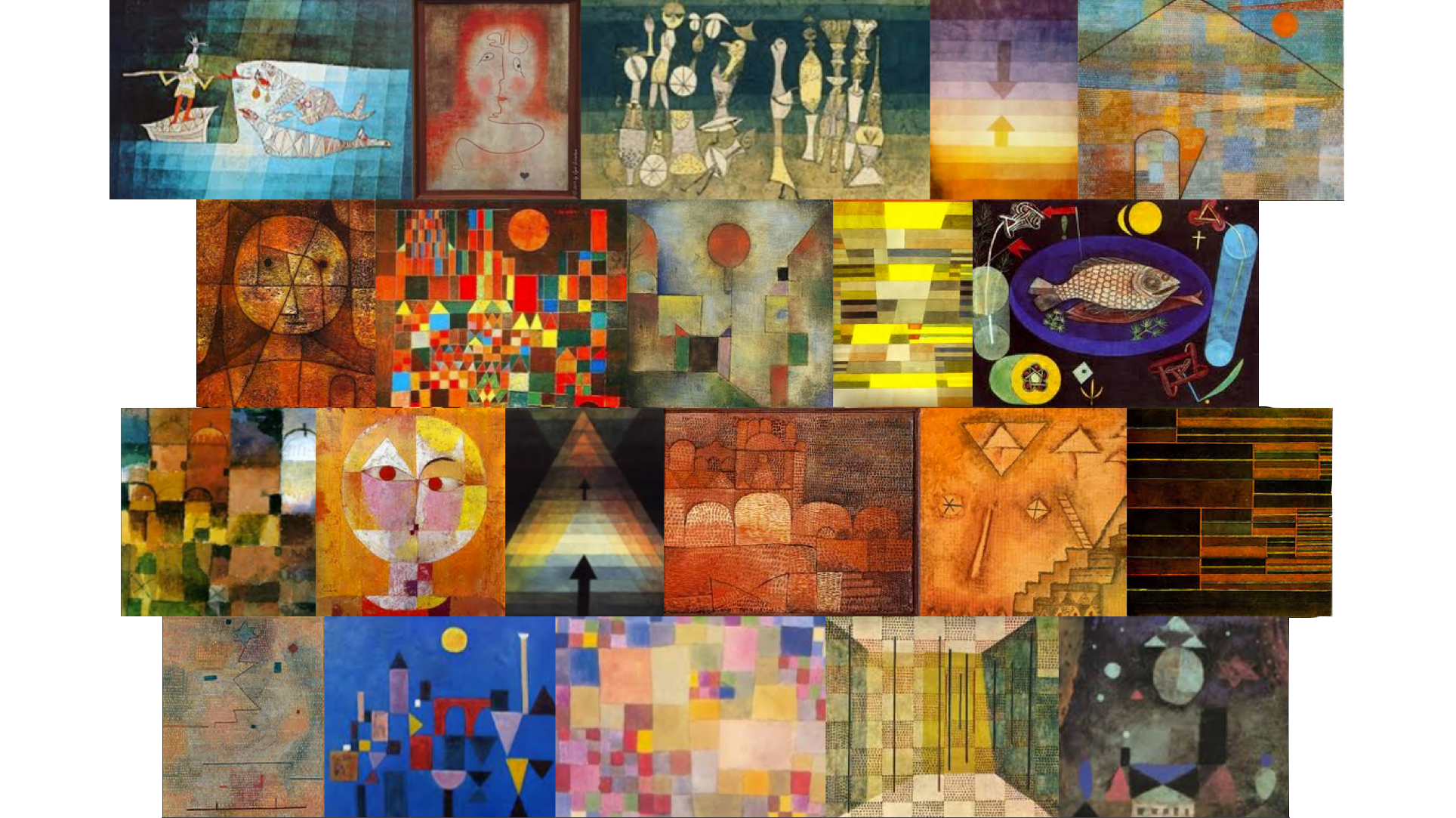
0% frame
|
These 3 representations of a stone artwork illustrate the distinctions between stone, air, and intersection between stone and air. Look hard at each, and compare the three: |
Line and tone drawing by Wendy MacNaughton, of a detail from Lacy Wall (stone and air, 2013) by Dan Snow and Edward Tufte. |
