Google Chrome platform
September 3, 2008 | Tchad
8 Comment(s)
GOOGLE CHROME NARRATIVE

Cartoons with real voices
This is a good example of complex information made simple
by paying attention to information density and respecting
the reader’s intelligence.
The Google Chrome Comic Book
https://www.google.com/googlebooks/chrome/index.html
We have been watching Scott McCloud on this thread
for quite some time… see above ( 2001 ).
Scott, if you are reading: Well done.
Scott McCloud’s website
http://www.scottmccloud.com/


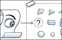
I noticed that the folks at Google gave a tip of the hat to ET in the cartoon about their new Chrome browser:
I think the comic book was very successful. It was clearly aimed at early adopters, and
the more you read, the more technical detail it provided, which was logical. Both I and a
geek friend of mine finished the book, which we would not have done if it was just text.
Thanks to the many contributors who pointed out Scott’s kind link in the example of amazon search.
David Pogue’s report in The
New York Times suggests this browser leads to an integrated platform with non-proprietary formats (very good)
but is still application-based rather than document-based (not very good).
It may be interesting to expound on the differences
between application based and document based
in the context of the new wave of “Netbook” computers.
It is certainly possible that we might carry around computers
with nothing on them except the ability to connect to the
Internet.
Do we think that documents are all going to become structured
data files that separate the information and the mark-up?
Certainly there are arguments for, and examples of, this but then
there are also strong arguments that the mark-up [read:design]
is one the the ways that the data moves up the information food chain.
Perhaps we could make good applications that are small enough,
or readily available by instant download, that we could make each
document have its ideal editor built in to itself.
Certainly Google Chrome moves towards making this a possibility.
A lightweight application could be embedded in a file and Chrome is fast
and stable enough to make the experience reasonable. It could also be
run on Firefox or Explorer albeit slower… unless the Google’s
contribution becomes the new standard.
Regarding the comic book:
I was one who failed to finish the comic. I kept having this urge to want to flip through it, to see where I was, to see where I was going. (Perhaps it told me at the beginning that I was entering a 39-page journey and I missed it. If so, I doubt I was the only one.) I felt trapped in the sequential nature of the presentation format. I wanted to put more pages in front of my eyes, to scan ahead to see where the topics were leading, and, most importantly, to see how much further I would have to read before I got done. The pages were numbered but they just said “20”, not “20 of 39”. Arrgh.
The comic nature was nice (I kind of liked the names of the real people; it gave it some street cred) but the short pages confined and controlled my reading. Some of this is the result of this being web-based, I’m sure. But why not make it taller and let me view it as a really long page, at least I could easily control the back and forth movement (like the Philip Greenspun HTML primer linked on the page I am using to input this post). Or, better yet, make it available on paper!!!
So I gave up.
As I was reading, however, my Firefox browser kept telling me that I needed the newest version, so I did that download and install. One new “improvement” of the Firefox browser dovetails into the discussion of Chrome in the comic above: in the new Firefox, the autofill list of sites that match my typing shows the entries now two rows deep, with one being the page title of the URL and one being the URL itself. Of course, this is batty, as they are presented in two different formats and letter sizes. I much preferred the simple listing of the urls, as my eye could quickly zip down the list of similar features and detect the item I sought.
So, if I type “www.ed” I get something like this:
(Please pardon my inability to show some of the other confusing accessories that are actually in the list: different sizes of letters and different colors for the two kinds of entries, bolded and underlined letters to show what text matched what I had typed, and a little icon out front of the page name.)
Oh, and the list only goes 6 entries deep but requires twelve lines to do so. After that, I am resigned to another dreaded scroll bar. God gave my eyes the ability to scroll a heckuva lot faster than my fingers can navigate a mouse and scroll bar. Please let me use my eyes to scan and let me avoid those dastardly scroll bars in those little boxes. If you want to show me two different things, make them different columns. Please don’t alternate formats within a column.
With the alternating name and then URL, my visual search task is greatly hindered. I went looking for an option to return it to the old ways but I couldn’t find it.
Summary:
Rafe
http://valleywag.com/5044902/the-5-most-laughable-terms-of-service-on-the-net
Here’s an update and more detailed account from arstechnica:
http://arstechnica.com/news.ars/post/20080903-google-on-chrome-eula-controversy-our-bad-well-change-it.html
Further update; Google repairs terms of service:
http://googleblog.blogspot.com/2008/09/update-to-google-chromes-terms-of.html
An important point about Scott McCloud’s Chrome comic book is that it was designed to be printed, not read on-screen.
Garr Reynolds (http://www.presentationzen.com/presentationzen/2008/09/google-goes-visual-simple-to-explain-chrome.html) quotes McCloud saying “It was designed as a printed comic for journalists and bloggers….We’ll put something even better together soon.”
That explains the slightly clunky way it works on the web.
Chrome is now becoming the platform that it hinted at in the early days.
http://googleblog.blogspot.com/
“Google Chrome OS is an open source, lightweight operating system that will initially be targeted at netbooks. Later
this year we will open-source its code, and netbooks running Google Chrome OS will be available for consumers in the
second half of 2010. Because we’re already talking to partners about the project, and we’ll soon be working with the
open source community, we wanted to share our vision now so everyone understands what we are trying to achieve.”